Navigation » List of Schools, Subjects, and Courses » Math 10 – Introduction to Statistics » Section 2.3 Homework » Section 2.3 Homework Question 4
With Answers Good news! We are showing you only an excerpt of our suggested answer to this question. Should you need our help in customizing an answer to this question, feel free to send us an email at  or chat with our customer service representative.
Section 2.3 Homework Question 4
Section 2.3 Homework
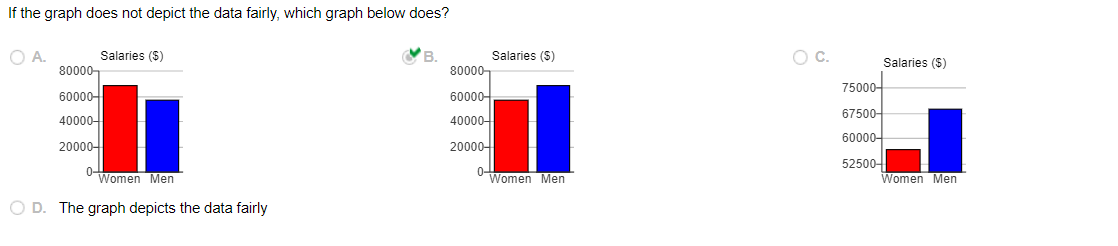
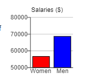
4. The graph to the right compares teaching salaries of women and men at private colleges and universities. What impression does the graph create? Does the graph depict the data fairly? If not, construct a graph that depicts the data fairly.
What impression does the graph create?
- The graph creates the impression that men and women have approximately the same salaries.
- The graph creates the impression that men have salaries that are more than twice the salaries of women.
- The graph creates the impression that women have salaries that are slightly higher than that of men.
- The graph creates the impression that men have salaries that are slightly higher than that of women.
Does the graph depict the data fairly?
- No, because the data are two-dimensional measurements.
- Yes, because the bars accurately represent each average.
- No, because the vertical scale does not start at zero.
- Yes, because the vertical scale is appropriate for the data.
If the graph does not depict the data fairly, which graph below does?