
Navigation » List of Schools, Subjects, and Courses » Math 120 – Introductory Probability and Statistics » Homeworks » Homework 4
No Answers We dont have answer to this question yet. If you need help with your homework send us an email  or chat with our tutors
Homework 4
Homework 4
1. A frequency distribution lists the ______ of occurrences of each category of data, while a relative frequency distribution lists the _______ of occurrences of each category of data.
2. In a relative frequency distribution, what should the relative frequencies add up to? Select the correct choice and, if necessary, fill in the answer box to complete your choice.
The relative frequencies add up to ___
The relative frequencies add up to the total number of observations.
3. What is a bar graph? What is a Pareto chart?
What is a bar graph?
- A bar graph is a horizontal or vertical representation of the frequency or relative frequency of the categories. The height of each rectangle represents the category’s frequency or relative frequency.
- A bar graph is a circular graph that uses bars to divide it into segments corresponding to each category. The segments are proportional to the frequency of its category.
- A bar graph represents the frequencies of values either from left-to-right or right-to-left. The different segments of the bar are used to indicate the different frequencies of each category.
What is a Pareto chart?
- A Pareto chart is a display of two data sets side by side where the height of each rectangle represents the category’s frequency or relative frequency.
- A Pareto chart is a bar graph whose bars are drawn in decreasing order of frequency or relative frequency.
- A Pareto chart is a combination of a pie chart and a bar graph.
4 . The pie chart below depicts the beverage size customers choose while at a fast food restaurant. Complete parts (a) through (c).
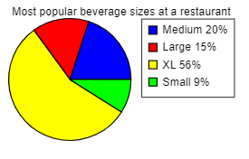
(a) What is the most popular size? What percentage of customers choose this size?
- Small; 9%
- Medium; 20%
- XL; 56%
- Large; 15%
(b) What is the least popular size? What percentage of customers choose this size?
- Large; 15%
- Medium; 20%
- XL; 56%
- Small; 9%
(c) What percent of customers choose a medium-sized beverage?
- 19%
- 15%
- 20%
- 61%
5. The following Pareto chart shows the position played by the most valuable player (MVP) in a certain baseball league for the last 95 years. Use the chart to answer parts (a) through (d).
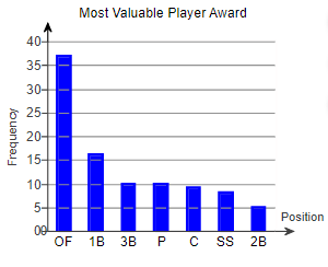
(a) Which position had the most MVPs? The position with the most MVPs was _____
(b) How many MVPs played short stop (SS)?
_____ MVPs played short stop.
(c) How many more MVPs played outfield (OF) than short stop?
_______more MVPs played outfield than short stop. (Type a whole number.)
(d) There are three outfield positions (left field, center field, right field). Given this, how might the graph be misleading?
- The positions or combinations of positions should be chosen so that all the bars are closer together in height.
- The chart seems to show that one position has many more MVPs because three positions are combined into one. They should be separated.
- The graph is misleading because the bars are decreasing in height from left to right.
- All the information is true, so the graph is not misleading.
6. In a poll, a random sample of 2163 adults (aged 18 and over) was asked, “When you see an ad emphasizing that a product is made in your country, are you more likely to buy it, less likely to buy it, or neither more nor less likely to buy it?” The results of the survey are presented in the side-by-side graph. Complete parts (a) through (d) below.
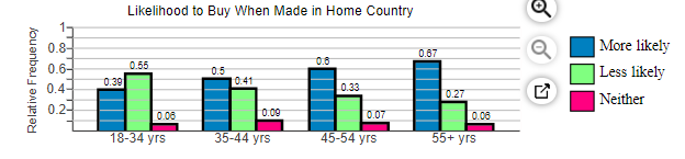
(a) What proportion of 18- to 34-year-old respondents are more likely to buy when made in their country? What proportion of 35- to 44-year-old respondents are more likely to buy when made in their country?
The proportion of 18- to 34-year-old respondents is ______
The proportion of 35- to 44-year-old respondents is ______
(b) What age group has the greatest proportion who are more likely to buy when made in their country?
- 55+ yrs
- 35-44 yrs
- 18-34 yrs
- 45-54 yrs
(c) Which age group has a majority of respondents who are less likely to buy when made in their country?
- 55+ yrs
- 18 34 yrs
- 45-54 yrs
- 35-44 yrs
(d) What is the apparent association between age and likelihood to buy when made in their country?
- As age decreases, likelihood to buy homegrown increases.
- As age increases, so does likelihood to buy homegrown.
- There is no apparent association between age and likelihood to buy homegrown.
7. A random sample of 100 adults aged 18 years or older were given a list of ice cream flavors and were asked to list which flavors they liked. The responses are given below.
|
Chocolate |
45 |
|
Strawberry |
42 |
|
Vanilla |
23 |
|
Mocha |
19 |
Which of the following graphs would be most appropriate for visually displaying the results?
- Pie Chart
- Frequency Bar Graph
- Relative Frequency Bar Graph
8. A random sample of 110 adult women aged 18 years or older and an independent random sample of 115 adult men aged 18 years or older was asked, “Which of the following traits would you most like to have in your significant other?” Respondents could only choose one answer.
(a) Beauty
(b) Wealth
(c) Health
(d) Sense of Humor
(e) Faithfulness
Which of the following would be most appropriate in displaying this data?
- A side-by-side relative frequency bar chart
- A pie chart for women and a separate pie chart for men
- A relative frequency bar chart for women and a separate relative frequency bar chart for men
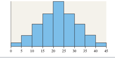
9. What is the shape of the distribution shown?
Choose the correct answer below.
- Symmetric and uniform
- Skewed right
- Skewed left
- Symmetric and bell-shaped
10. What is the shape of the distribution shown?
Choose the correct answer below.
- Symmetric and bell-shaped
- Skewed right
- Aymmetric and uniform
- Skewed left
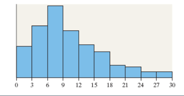
11. The following frequency histogram represents the IQ scores of a random sample of seventh-grade students. IQs are measured to the nearest whole number. The frequency of each class is labeled above each rectangle. Use the histogram to answers parts (a) through (g).
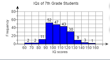
(a) How many students were sampled? ___ students
(b) Determine the class width. The class width is ____
(c) Identify the classes and their frequencies. Choose the correct answer below.
- 60-70, 2; 70-80, 2; 80-90, 11; 90-100, 52; 100-110, 47; 110-120, 43; 120-130, 30;130-140, 9; 140-150, 3; 150-160, 1
- 60-69, 2; 70-79, 2; 80-89, 11; 90-99, 52; 100-109, 47; 110-119, 43; 120-129, 30; 130-139, 9; 140-149, 3; 150-159, 1
- 65, 2; 75, 2; 85, 11; 95, 52; 105, 47; 115, 43; 125, 30; 135, 9; 145, 3; 155, 1
(d) Which class has the highest frequency?
- 90-100
- 100-109
- 90-99
- 95
(e) Which class has the lowest frequency?
- 150-159
- 60-69
- 155
- 150-160
(f) What percent of students had an IQ of at least 130? ___%
(g) Did any students have an IQ of 165?
- No, because there are no bars, or frequencies, greater than an IQ of 160.
- Yes, because there is a frequency of a score of 165.
- No, because there is a bar in the 150-159 class.
- Yes, because there is a bar in the 150-159 class.
12. The data to the right represent the top speed (in kilometers per hour) of all the players (except goaltenders) in acertain soccer league. Find (a) the number of classes, (b) the class limits for the third class, and (c) the class width.
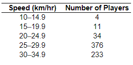
(a) There are _____classes.
(b) The lower class limit for the third class is The upper class limit for the third class is
(c) The class width is
13. Why shouldn’t classes overlap when summarizing continuous data in a frequency or relative frequency distribution? Choose the correct answer below.
- Classes shouldn’t overlap so that they are open ended.
- Classes shouldn’t overlap so that the distribution is not skewed in one direction.
- Classes shouldn’t overlap so there is no confusion as to which class an observation belongs.
- Classes shouldn’t overlap so that the class width is as small as possible.
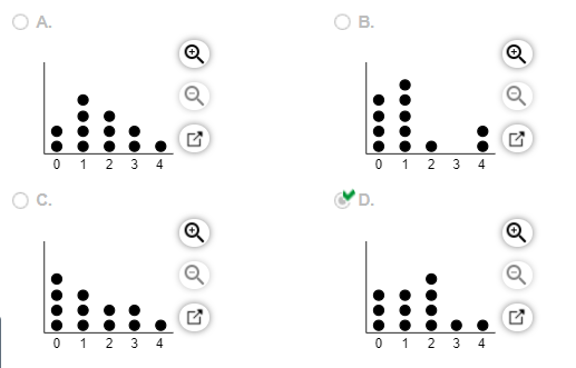
14. A researcher wanted to determine the number of televisions in households. He conducts a survey of 40 randomly selected households and obtained the data to the right. Draw a dot plot of the televisions per household.

Choose the correct dot plot below.

15. A group of 12 randomly selected students were asked how many traffic tickets they have received since they started driving.

Create a dot plot of the data.
or chat with our tutors