
Navigation » List of Schools, Subjects, and Courses » Math 120 – Introductory Probability and Statistics » Quizzes » Quiz 3
No Answers We dont have answer to this question yet. If you need help with your homework send us an email  or chat with our tutors
Quiz 3
Quiz 3
1. What is a bar graph? What is a Pareto chart? What is a bar graph?
- A bar graph is a horizontal or vertical representation of the frequency or relative frequency of the categories. The height of each rectangle represents the category’s frequency or relative frequency.
- A bar graph is a circular graph that uses bars to divide it into segments corresponding to each category. The segments are proportional to the frequency of its category.
- A bar graph represents the frequencies of values either from left-to-right or right-to-left. The different segments of the bar are used to indicate the different frequencies of each category.
What is a Pareto chart?
- A Pareto chart is a combination of a pie chart and a bar graph.
- A Pareto chart is a bar graph whose bars are drawn in decreasing order of frequency or relative frequency.
- A Pareto chart is a display of two data sets side by side where the height of each rectangle represents the category’s frequency or relative frequency.
2. The following Pareto chart shows the position played by the most valuable player (MVP) in a certain baseball league for the last 97 years. Use the chart to answer parts (a) through (d).
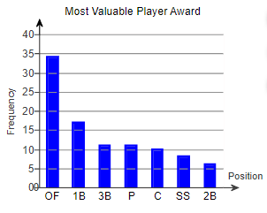
(a) Which position had the most MVPs? The position with the most MVPs was ____
(b) How many MVPs played pitcher (P)? ____ MVPs played pitcher.
(c) How many more MVPs played outfield (OF) than pitcher? ____ more MVPs played outfield than pitcher.
(d) There are three outfield positions (left field, center field, right field). Given this, how might the graph be misleading?
- The graph is misleading because the bars are decreasing in height from left to right.
- The positions or combinations of positions should be chosen so that all the bars are closer together in height.
- The chart seems to show that one position has many more MVPs because three positions are combined into one. They should be separated.
- All the information is true, so the graph is not misleading.
3. A national survey asked people, “How often do you eat out for dinner, instead of at home?” The frequencies were as follows. Complete parts (a) through (g).
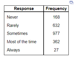
(a) Construct a relative frequency distribution of the data.
| Response | Relavie Frequency |
| Never | |
| Rarely | |
| Sometimes | |
| Most of the time | |
| Always | |
(b) What percentage of respondents answered “Always”? _____
(c) What percentage of respondents answered “Never” or “Rarely”?
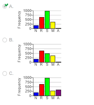
(d) Construct a frequency bar graph. Choose the correct answer below.
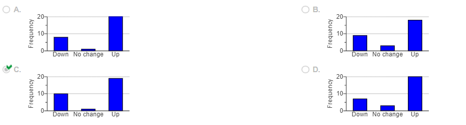
4. The table shows the movement of a stock for 30 randomly selected trading days. “Up” means the stock price increased in value for the day, “Down” means the stock price decreased in value for the day, and “No change” means the stock price closed at the same price it closed for the previous day. Complete parts (a) through (e) below.
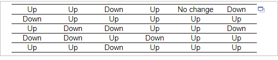
| Movement | Frequency |
| Down | 10 |
| No Change | 1 |
| Up | 19 |
| Movement | Relative Frequency |
| Down | |
| No Change | |
| Up |
Construct a frequency bar graph. Choose the correct graph below.
5. The ages and gender of individuals who received speeding tickets in the past 30 days is shown in the table below. Use this information to answer parts a through c.
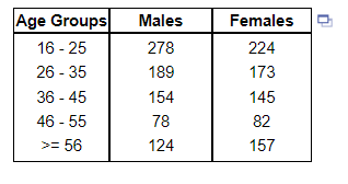
(a) Construct a relative frequency distribution of the males who received tickets.
| Age Group | Relative Frequency |
| 16-25 | |
| 26-35 | |
| 36-45 | |
| 46-55 | |
| >=56 |
(b) Construct a relative frequency distribution of the females who received tickets.
| Age Group | Relative Frequency |
| 16-25 | |
| 26-35 | |
| 36-45 | |
| 46-55 | |
| >=56 |
(c) Construct a side-by-side relative frequency bar graph. Choose the correct graph below where in each age grouping, the left bar represents males and the right bar represents females.
6. The data to the right represent the top speed (in kilometers per hour) of all the players (except goaltenders) in acertain soccer league. Find (a) the number of classes, (b) the class limits for the first class, and (c) the class width.
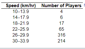
(a) There are ____ classes
(b) The lower class limit for the first class is ___
The upper class limit for the first class is
(c) The class width is
7. The following data represent the number of potholes on 35 randomly selected 1-mile stretches of highway around a particular city. Complete parts (a) through (d) to the right.
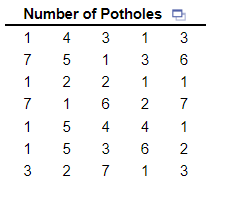
(a) Construct a frequency distribution of the data.
| Potholes | Frequency |
| 1 | |
| 2 | |
| 3 | |
| 4 | |
| 5 | |
| 6 | |
| 7 |
(b) Construct a relative frequency distribution of the data.
8. What is the shape of the distribution shown?
Choose the correct answer below.
- Symmetric and uniform
- Skewed left
- Skewed right
- Symmetric and bell-shaped
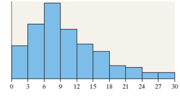
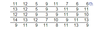
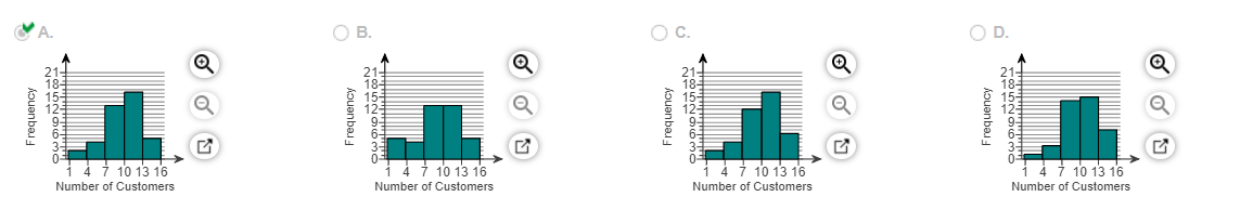
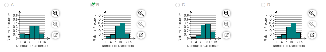
9. The data to the right represent the number of customers waiting for a table at 6:00 P.M. for 40 consecutive Saturdays at Bobak’s Restaurant. Complete parts (a) through (h) below.
(a) Are these data discrete or continuous? Explain.
- The data are discrete because there are a finite or countable number of values.
- The data are continuous because there are a finite or countable number of values.
- The data are continuous because it was recorded for 40 consecutive Saturdays.
- The data are discrete because it was recorded for 40 consecutive Saturdays.
(b) Construct a frequency distribution of the data.
| No. of Customers | Frequency |
| 1-3 | |
| 4-6 | |
| 7-9 | |
| 10-12 | |
| 13-15 |
(c) Construct a relative frequency distribution of the data.
| No. of Customers | Frequency |
| 1-3 | |
| 4-6 | |
| 7-9 | |
| 10-12 | |
| 13-15 |
(d) What percentage of the Saturdays had 7 or more customers waiting for a table at 6:00 P.M.?
(e) What percentage of the Saturdays had 6 or fewer customers waiting for a table at 6:00 P.M.?
(f) Construct a frequency histogram of the data. Choose the correct histogram below.
(g) Construct a relative frequency histogram of the data. Choose the correct histogram below.
or chat with our tutors