
Navigation » List of Schools, Subjects, and Courses » Math 1140 – Introduction to Statistics » Homeworks » Chapter 2 Homework
With Answers Good news! We are showing you only an excerpt of our suggested answer to this question. Should you need our help in customizing an answer to this question, feel free to send us an email at  or chat with our customer service representative.
Chapter 2 Homework
Chapter 2 Homework
1. A frequency table of grades has five classes (A, B, C, D, F) with frequencies of 3, 13, 14, 4, and 2 respectively. Using percentages, what are the relative frequencies of the five classes?
Complete the table.
| Grade | Frequency | Relative Frequency |
| A | 3 | |
| B | 13 | |
| C | 14 | |
| D | 4 | |
| F | 2 |
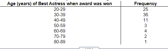
2. The following data show the ages of recent award-winning male actors at the time when they won their award. Make a frequency table for the data, using bins of 20-29, 30-39, and so on.
| Age | No. of Actors |
| 20-29 | |
| 30-39 | |
| 40-49 | |
| 50-59 | |
| 60-69 | |
| 70-79 |
3. Among fatal plane crashes that occurred during the past 65 years, 537 were due to pilot error, 62 were due to other human error, 548 were due to weather, 286 were due to mechanical problems, and 308 were due to sabotage. Construct the relative frequency distribution. What is the most serious threat to aviation safety, and can anything be done about it?
Complete the relative frequency distribution below.
| Cause | Relative Frequency |
| Pilot Error | |
| Other Human Error | |
| Weather | |
| Mechanical Problems | |
| Sabotage |
What is the most serious threat to aviation safety, and can anything be done about it?
- Sabotage is the most serious threat to aviation safety. Airport security could be increased.
- Mechanical problems are the most serious threat to aviation safety. New planes could be better engineered.
- Pilot error is the most serious threat to aviation safety. Pilots could be better trained.
- Weather is the most serious threat to aviation safety. Weather monitoring systems could be improved
4. Identify the lower class limits, upper class limits, class width, class midpoints, and class boundaries for the given frequency distribution. Also identify the number of individuals included in the summary.
Identify the lower class limits.
Identify the upper class limits.
Identify the class width.
Identify the class midpoints.
Identify the class boundaries.
Identify the number of individuals included in the summary.
5. Construct the cumulative frequency distribution for the given data.
| Age (years) of Best Actress when award was won | Frequency |
| Less than 30 | 25 |
| Less than 40 | 61 |
| Less than 50 | 72 |
| Less than 60 | 75 |
| Less than 70 | 79 |
| Less than 80 | 81 |
| Less than 90 | 82 |
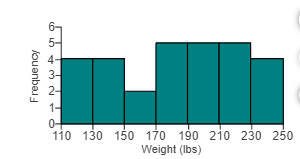
6. The histogram to the right represents the weights (in pounds) of members of a certain high-school math team. How many team members are included in the histogram?

The histogram represents _____ math team members.
7. The histogram to the right represents the weights (in pounds) of members of a certain high-school debate team. What is the class width? What are the approximate lower and upper class limits of the first class?
What is the class width?
The class width is
What are the approximate lower and upper class limits of the first class?
The approximate lower class limit is
The approximate upper class limit is
8. The table below shows the frequency distribution of the weights (in grams) of pre-1964 quarters. Use the frequency distribution to construct a histogram. Does the histogram appear to depict data that have a normal distribution? Why or why not?
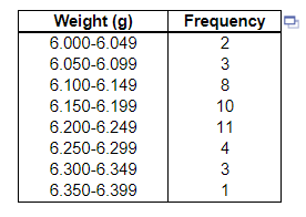
Choose the correct histogram below.

Does the histogram appear to depict data that have a normal distribution?
- The histogram appears to depict a normal distribution. The frequencies generally increase to a maximum and then decrease, and the histogram is roughly symmetric.
- The histogram does not appear to depict a normal distribution. The frequencies generally increase and the histogram is roughly symmetric.
- The histogram does not appear to depict a normal distribution. The frequencies generally decrease to a minimum and then increase, and the histogram is roughly symmetric.
- The histogram appears to depict a normal distribution. The frequencies generally decrease to a minimum and then increase
9. The table shows the magnitudes of the earthquakes that have occurred in the past 10 years. Use the frequency distribution to construct a histogram. Does the histogram appear to be skewed? If so, identify the type of skewness
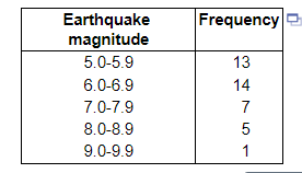
Construct the histogram. Choose the correct graph below.
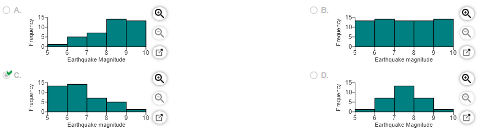
The histogram ______ so the distribution of the data is _______
10. Fill in the blank.
The heights of the bars of a histogram correspond to _______ values.
11. Fill in the blank.
The bars in a histogram _______.
12. Fill in the blank.
A histogram aids in analyzing the _______ of the data.
13. Fill in the blank.
A(n) _______ distribution has a “bell” shape.