
Navigation » List of Schools, Subjects, and Courses » Math 136 – Introduction to Statistics » Homeworks » Section 2.1 Homework
No Answers We dont have answer to this question yet. If you need help with your homework send us an email  or chat with our tutors
Section 2.1 Homework
Section 2.1 Homework
1. A frequency distribution lists the ______ of occurrences of each category of data, while a relative frequency distribution lists the _____ of occurrences of each category of data.
2. In a relative frequency distribution, what should the relative frequencies add up to? Select the correct choice and, if necessary, fill in the answer box to complete your choice.
- The relative frequencies add up to ____
- The relative frequencies add up to the total number of observations.
3. What is a bar graph? What is a Pareto chart? What is a bar graph?
- A bar graph represents the frequencies of values either from left-to-right or right-to-left. The different segments of the bar are used to indicate the different frequencies of each category.
- A bar graph is a horizontal or vertical representation of the frequency or relative frequency of the categories. The height of each rectangle represents the category’s frequency or relative frequency.
- A bar graph is a circular graph that uses bars to divide it into segments corresponding to each category. The segments are proportional to the frequency of its category.
What is a Pareto chart?
- A Pareto chart is a combination of a pie chart and a bar graph.
- A Pareto chart is a display of two data sets side by side where the height of each rectangle represents the category’s frequency or relative frequency.
- A Pareto chart is a bar graph whose bars are drawn in decreasing order of frequency or relative frequency.
4. The pie chart below depicts the beverage size customers choose while at a fast food restaurant. Complete parts (a) through (c).
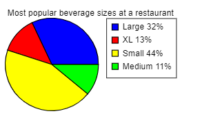
(a) What is the most popular size? What percentage of customers choose this size?
- Large; 32%
- Medium; 11%
- XL; 13%
- Small; 44%
(b) What is the least popular size? What percentage of customers choose this size?
- Small; 44%
- Medium; 11%
- Large; 32%
- XL; 13%
(c) What percent of customers choose a large-sized beverage?
- 61%
- 19%
- 32%
- 13%
5. The following Pareto chart shows the position played by the most valuable player (MVP) in a certain baseball league for the last 73 years. Use the chart to answer parts (a) through (d).
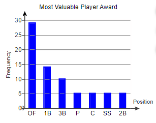
(a) Which position had the most MVPs?The position with the most MVPs was _____
(b) How many MVPs played second base (2B)? _____ MVPs played second base.
(c) How many more MVPs played outfield (OF) than second base?
_____ more MVPs played outfield than second base. (Type a whole number.)
(d) There are three outfield positions (left field, center field, right field). Given this, how might the graph be misleading?
- The chart seems to show that one position has many more MVPs because three positions are combined into one. They should be separated.
- The graph is misleading because the bars are decreasing in height from left to right.
- The positions or combinations of positions should be chosen so that all the bars are closer together in height.
- All the information is true, so the graph is not misleading.
6. In a poll, a random sample of 2163 adults (aged 18 and over) was asked, “When you see an ad emphasizing that a product is made in your country, are you more likely to buy it, less likely to buy it, or neither more nor less likely to buy it?” The results of the survey are presented in the side-by-side graph. Complete parts (a) through (d) below.
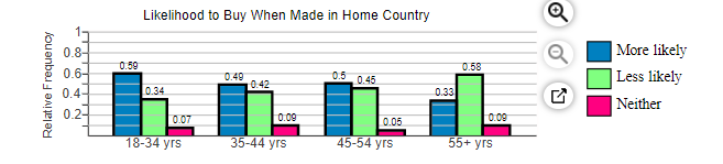
(a) What proportion of 18- to 34-year-old respondents are more likely to buy when made in their country? What proportion of 35- to 44-year-old respondents are more likely to buy when made in their country?
The proportion of 18- to 34-year-old respondents is
The proportion of 35- to 44-year-old respondents is
(b) What age group has the greatest proportion who are more likely to buy when made in their country?
- 55+ yrs
- 45-54 yrs
- 18-34 yrs
- 35-44 yrs
(c) Which age group has a majority of respondents who are less likely to buy when made in their country?
- 55+ yrs
- 18-34 yrs
- 35-44 yrs
- 45-54 yrs
(d) What is the apparent association between age and likelihood to buy when made in their country?
- As age decreases, likelihood to buy homegrown increases.
- As age increases, so does likelihood to buy homegrown.
- There is no apparent association between age and likelihood to buy homegrown.
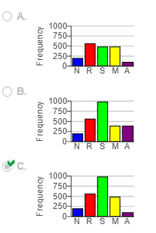
7. A national survey asked people, “How often do you eat out for dinner, instead of at home?” The frequencies were as follows. Complete parts (a) through (g).
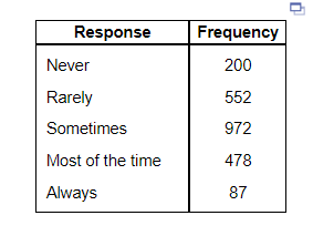
(a) Construct a relative frequency distribution of the data.
| Response | Relative Frequency |
| Never | |
| Rarely | |
| Sometimes | |
| Most of the time | |
| Always |
(b) What percentage of respondents answered “Always”?
(c) What percentage of respondents answered “Never” or “Rarely”?
(d) Construct a frequency bar graph. Choose the correct answer below.
8. An airline offers discounted flights from Atlanta to five American cities. Below is a frequency distribution of the number of tickets purchased for each location based on a random sample of purchased tickets. Complete parts (a) through (f).
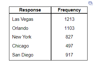
(a) Construct a relative frequency distribution of the data.
| Response | Relative Frequency |
| Las Vegas | |
| Orlando | |
| New York | |
| Chicago | |
| San Diego |
(b) What proportion of the tickets were for New York?
(c) Construct a frequency bar graph. Choose the correct answer below.
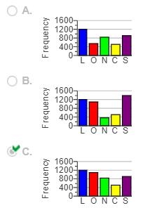
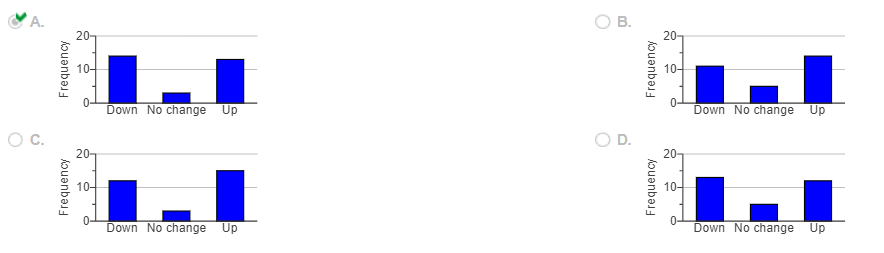
9. The table shows the movement of a stock for 30 randomly selected trading days. “Up” means the stock price increased in value for the day, “Down” means the stock price decreased in value for the day, and “No change” means the stock price closed at the same price it closed for the previous day. Complete parts (a) through (e) below.
(a) Construct a frequency distribution.
| Movement | Frequency |
| Down | |
| No Change | |
| Up |
(b) Construct a relative frequency distribution.
| Movement | Relative Frequency |
| Down | |
| No Change | |
| Up |
(c) Construct a frequency bar graph. Choose the correct graph below.
10. Consider the information in the “Why we can’t lose weight” chart shown to the right, which is in the magazine style of graph. Could the information provided be organized into a pie chart? Why or why not? Choose the correct answer below.
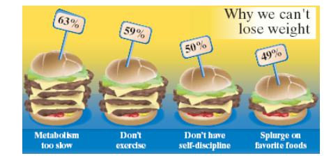
- No. There are more than 3 categories of data.
- Yes. The information could be organized into a pie chart.
- No. The values in the table are not decimals.
- No. The percentages add up to more than 100%.
or chat with our tutors