
Navigation » List of Schools, Subjects, and Courses » Math 136 – Introduction to Statistics » Homeworks » Section 2.3 Homework
No Answers We dont have answer to this question yet. If you need help with your homework send us an email  or chat with our tutors
Section 2.3 Homework
Section 2.3 Homework
1. The accompanying frequency polygon represents the number of a country’s residents below 100 years of age. Complete parts (a) through (f) below.
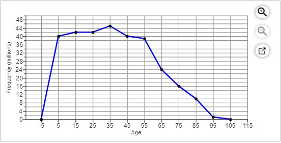
(a) What is the class width? How many classes are represented in the graph?
The class width is _____. There are _____classes represented in the graph.
(b) What is the midpoint of the first class? What are the lower and upper limits of the first class? Assume the lower and upper class limits are whole numbers.
The midpoint of the first class is
The lower limit of the first class is
The upper limit of the first class is
(c) What is the midpoint of the last class? What are the lower and upper limits of the last class? Assume the lower and upper class limits are whole numbers.
The midpoint of the last class is
The lower limit of the last class is
The upper limit of the last class is
(d) Which age group has the highest population?
10-19
40-49
30-39
90-99
(e) Which age group has the lowest population?
- 0-9
- 90-99
- 80-89
- 30-39
(f) Which age group has 24 million?
- 40-49
- 60-69
- 50-59
- 70-79
2. The accompanying relative frequency ogive represents the composite score on a standardized test for a high school graduating class. Complete parts (a) through (d) below.
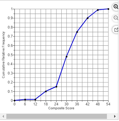
(a) What is the class width?
(b) Approximately 15% of students had a composite score below what level?
(c) What percentage of students had a composite score less than 36?
(d) Ten percent of students had a composite score above what level?
3. The time-series plot to the right shows the annual unemployment rate and the annual inflation rate over a period of 19 years. Complete parts (a) through (f) below.
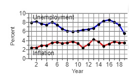
(a) Estimate the unemployment rate in year 5. The unemployment rate in year 5 was approximately
(b) In what year was the unemployment rate highest? The unemployment rate was highest in year
(c) In what year was the inflation rate highest? The inflation rate was highest in year
(d) In what year were the unemployment rate and inflation rate closest? furthest? The unemployment rate and inflation rate were closest in year
The unemployment rate and inflation rate were furthest in year _____
(e) The misery index is defined as the sum of the unemployment rate and the inflation rate. According to the misery index, which year was more “miserable,” year 17 or year 19? The misery index for year 17 was approximately _______ and for year 19 approximately ______ so year _____was more “miserable.”
(f) Comment on the trend in the misery index between year 6 and year 10.
Choose the correct answer below.
- The misery index is decreasing from year 6 to year 10.
- The misery index is increasing from year 6 to year 10.
- The misery index decreases and then increases from year 6 to year 10.
- The misery index increases and then decreases from year 6 to year 10.
- The misery index is fairly constant from year 6 to year 10.
4. The data in the table represent the stock price for a company at the end of each month in 2015.
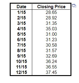
(a) Construct a time-series plot and comment on any trends.
(b) What was the percent change in the stock price of the company from January 2015 to December 2015?
(a) Which of the following is a time-series plot of the data?
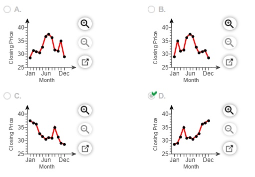
Comment on any trends. Choose the correct answer below.
- The stock price generally remained the same throughout the year.
- The stock price generally increased throughout the year.
- There was no discernible trend in the stock price throughout the year.
- The stock price generally decreased throughout the year.
(b) The percent change in the stock price of the company from January 2015 to December 2015 was ____
5. The cumulative relative frequency for the last class must always be 1. Why? Choose the correct answer below.
- The last class must always have at least one value in it.
- All the observations are less than the last class.
- All the observations are less than or equal to the last class.
6. What type of variable is required when drawing a time-series plot? Why do we draw time-series plots? A ____ is required when drawing a time-series plot.
Select all the reasons why time-series plots are used.
- Time-series plots are used to identify any outliers in the data.
- Time-series plots are used to examine the shape of the distribution of the data.
- Time-series plots are used to identify trends in the data over time.
- Time-series plots are used to present the relative frequency of the data in each interval or category.
or chat with our tutors