
Navigation » List of Schools, Subjects, and Courses » Math 136 – Introduction to Statistics » Homeworks » Section 2.4 Homework
No Answers We dont have answer to this question yet. If you need help with your homework send us an email  or chat with our tutors
Section 2.4 Homework
Section 2.4 Homework
1. The following graph shows the median earnings for females from 2005 to 2009 in constant 2009 dollars. Complete parts (a) and (b) below.
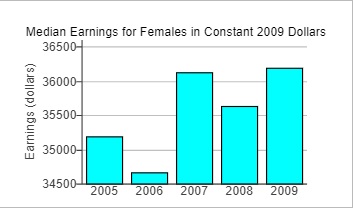
(a) How is the bar graph misleading? What does the graph seem to convey?
- The vertical axis starts at 34,500 instead of 0. This makes where the bars should start unclear. The vertical scaling is incorrect. All the bars look larger than they should.
- The horizontal axis ends at 2009 instead of this year. This means all of the data between 2009 and this year are included in the 2009 bar, so the 2009 bar is larger than it should be.
- The vertical axis starts at 34,500 instead of 0. This tends to indicate that the median earnings for females changed at a faster rate than it actually did.
- The horizontal axis starts at 2005 instead of 2000. This means all of the data from 2000 through 2004 are included in the 2005 bar, so the 2005 bar is larger than it should be.
(b) Redraw the graph so that it is not misleading. Choose the correct graph below.

What does the new graph seem to convey?
- This graph indicates that median earnings for females have remained fairly constant over the given time period.
- This graph indicates that median earnings for females have varied noticeably over the given time period.
- This graph indicates that median earnings for females have slowly increased over the given time period.
- This graph indicates that median earnings for females have remained completely unchanged over the given time period.
2. A newspaper article claimed that the afternoon hours were the worst in terms of robberies and provided the graph to the right in support of this claim. Explain how this graph is misleading.
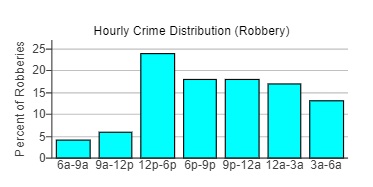
Choose the correct answer below.
- The vertical axis has no units. This can mislead readers into thinking that the percentages are actually counts.
- All of the bars are the same color, so they tend to blend visually with each other. This makes the graph hard to read.
- The vertical axis stops at 25%. It should go all the way up to 100% to accurately show percentage data.
- Not all of the time intervals are the same size. Redistributing the time interval so they are all the same size may lead to a different shape.
3. The accompanying histogram represents the total tax collected by a federal tax collection service for fifty regions of varying sizes and populations in a certain country. Explain why the graph is misleading. Why is the graph misleading?
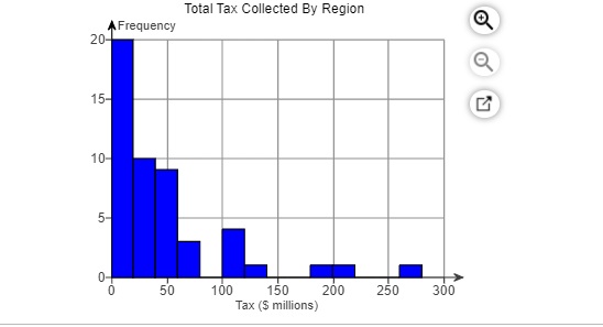
- The classes are not the same width.
- It does not take into account the size and population of each region.
- The horizontal tick mark intervals and vertical tick mark intervals are different sizes.
- It does not take into account the possibility that more than 20 regions may fall into the same class.
4. The graph to the right represents the expenditures of a company
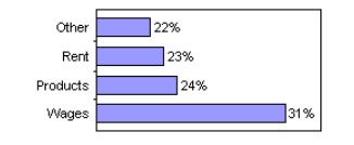
(a) How is the graph misleading?
- The graph is not misleading.
- It looks like half as much money is spent on wages than products.
- It looks like the rent is very cheap.
- It looks like twice as much money is spent on wages than products.
(b) What could be done to improve the graphic?
- The lengths of all the bars should be half as long.
- The wages bar should be made longer for emphasis.
- The graph does not need to be changed.
- The lengths of the bars should be proportional to the percentages
5. The safety manager at Bumbler Enterprises provides the graph shown on the right to the plant manager and claims that the rate of worker injuries has been reduced by 75% over a 12-year period. Does the graph support his claim? Explain.
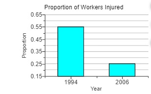
Choose the correct answer below.
- The graph does not support his claim. The vertical tick marks are too far apart to determine the exact value for the proportions.
- The graph does not support his claim. The vertical scale is different for each bar.
- The graph does not support his claim. The vertical scale does not start at 0 which distorts the percent of change.
- The graph supports his claim. The height of the bar for 2006 is less than or equal to 75% of the height of the bar for 1994.
6. The accompanying data represent health care expenditures per capita (per person) as a percentage of the gross domestic product (GDP) of a country from 2009 to 2015. Gross domestic product is the total value of all goods and services created during the course of the year. Complete parts (a) through (c) below.

(a) Construct a time-series plot that a politician would create to support the position that health care expenditures are increasing and must be slowed. Choose the correct graph below.
(b) Construct a time-series plot that the health care industry would create to refute the opinion of the politician. Choose the correct graph below.
(c) Explain how different measures may be used to support two completely different positions. Choose the correct answer below.
- Data can be rearranged on the graph to make the graph support any position.
- The data collected can be changed so that it will support the position.
- The scales used in the graph can significantly affect the message. Also, the variable used to convey the message on the graph can make a large difference as well.
- Values can be left out of the graph so that the graph supports the position.
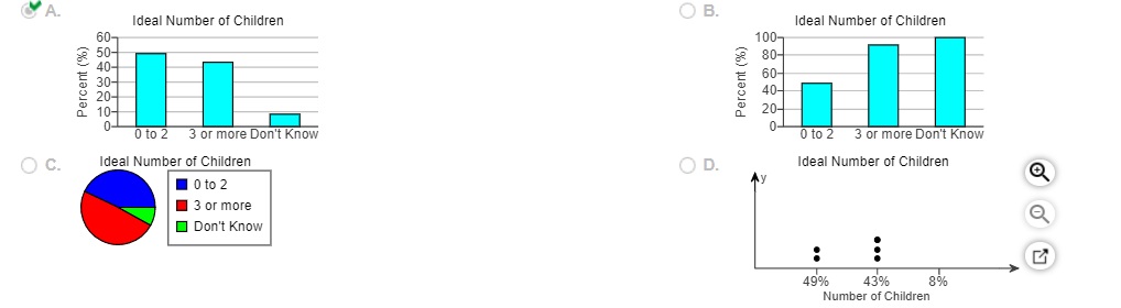
7 The following newspaper type graphic illustrates the ideal family size (total children) based on a survey of adults from a certain country. Complete parts (a) through (c) below.
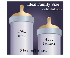
(a) What type of graphic is being displayed?
- Bar graph
- Pie chart
- Dot plot
(b) Describe any problems with the graphic. Select all that apply.
- The categories are not the same size, which misrepresents the data. There are far more possible responses that fall under “3 or more” than those that fall under “0 to 2.”
- This data should have been displayed using a stem-and-leaf plot or an ogive instead of the current graphic.
- A reader cannot tell whether the graph ends at the top of the nipple on the baby bottle or at the end of the milk.
- It is difficult to determine which option that the people who don’t know of an ideal family size responded.
(c) Construct a graphic that is not misleading and makes the data stand out. Choose the correct graphic below.
or chat with our tutors